Sometimes I really want to be a bit wilder with my colour choices. I thought my Alberta Springtime was a fairly strong painting colourwise, but check it out as a negative image!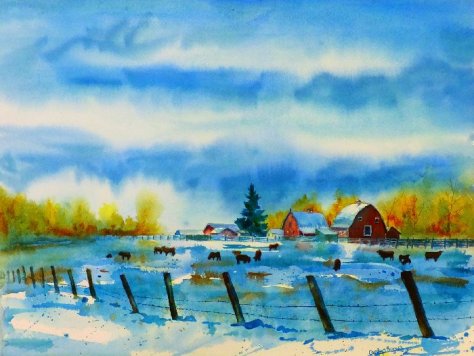
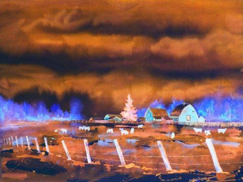
I’m terribly tempted to paint it this way. Look at those blues and oranges. But would people find this garish or beautiful hanging on the wall?
